 1-361-589-1048
Table of Contents
- What Makes Quality Screen Printing Stand Out
- Examining Sharpness and Design Clarity
- Assessing Color Vibrancy and Ink Coverage
- Understanding Plastisol vs Water-Based Ink
- The Hand Feel Test: What Quality Feels Like
- Signs of Poor Screen Printing to Avoid
- How to Wash Screen Printed Shirts for Longevity
- Testing Print Durability Before You Buy
- Frequently Asked Questions
What Makes Quality Screen Printing Stand Out
Quality screen printing means ink that stays vibrant, registration so precise you can't see color separation, and a hand feel that doesn't crack or fade. At The Wits End, we hand-screen apparel and stickers for customers who care about durability and design clarity.

The difference comes down to five core elements: sharp design lines, vibrant and consistent colors, strong ink adhesion to fabric, accurate color alignment during printing, and durability through repeated washing. A genuinely high-quality screen printed shirt should look as good on wash 30 as it does on wash one.
Examining Sharpness and Design Clarity
A sharp, clearly defined design signals quality screen printing. Blurry edges, fuzzy lines, and soft registration indicate poor mesh selection, inadequate squeegee pressure, or improper curing.
Registration refers to how precisely each color layer aligns on top of the previous one. Professional printers hold registration within a 1/16-inch tolerance. Anything looser shows visible misalignment.
Halftones are tiny dots that create the illusion of shading or gradients. When printed correctly, the dots are uniform in size, evenly spaced, and crisp. When printed poorly, they appear fuzzy or bleeding into each other.
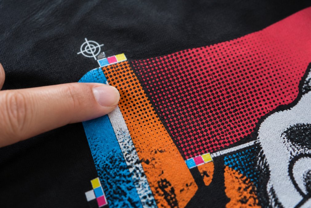
To test sharpness, look at fine lines in the design. Can you trace the edge of a color without seeing a fuzzy halo? Hold the shirt up to light and look for gaps where the ink didn't fully cover the fabric.
How registration accuracy affects line definition
When colors are misaligned, even slightly, the design loses sharpness and appears blurry. Examine the edges where colors meet, they should be clean and distinct. If you see color bleeding across the line or gaps between colors, the registration was off during printing.
Why halftones reveal printing skill
Halftones are the true test of a printer's technical skill. Creating clean, consistent halftones requires the right mesh count, proper ink viscosity, and precise squeegee pressure. A 305 mesh screen produces smaller dots that create smoother gradients than a 110 mesh screen (peer-reviewed research). Examine any design with gradients under good lighting, the dots should appear uniform and crisp, not fuzzy or bleeding together.
Assessing Color Vibrancy and Ink Coverage
Color vibrancy tells you whether the printer used quality ink and applied it with the right thickness. Dull, flat colors indicate old ink, incorrect mixing, or insufficient ink deposit. Vibrant colors that match the design file indicate proper ink selection and application.
Ink coverage refers to how completely the ink covers the fabric. If you can see the fabric weave through the ink, the coverage is insufficient. Quality screen printing produces opaque, fully saturated colors that don't fade when held up to light.
The consistency of color across the entire design also matters. If one section appears darker than another, it indicates uneven squeegee pressure during printing.
Opacity and opacity consistency across the design
Opacity is the degree to which the ink covers the fabric beneath it. For most designs, you want full opacity, the ink should completely hide the fabric color and weave. If you hold a shirt up to light and can see the fabric clearly through the ink, the opacity is too low. Opacity consistency is equally important; uneven opacity indicates poor technique or worn equipment.
Bleeding and blurry edges as quality indicators
Bleeding occurs when ink spreads beyond the intended design boundary. Both bleeding and blurry edges are signs of improper curing, incorrect ink viscosity, or inadequate mesh tension. Examine the edges of your design closely, they should be crisp and distinct. If edges appear soft or fuzzy, or if you see ink spreading into the fabric beyond the design line, that's a red flag.
Understanding Plastisol vs Water-Based Ink
The type of ink used dramatically affects durability, hand feel, and environmental impact.
Plastisol ink is PVC-based and requires heat curing (the EPA). It's durable, vibrant, and produces a slightly raised feel on the fabric. Plastisol is the industry standard because it's forgiving, produces consistent results, and creates prints that last for years. However, it has a heavier hand feel and isn't environmentally friendly.
Water-based ink is made from water, pigment, and binders (osha.gov). It requires lower heat curing and produces a softer hand feel because the ink soaks into the fabric rather than sitting on top of it. Water-based prints are more breathable and comfortable, but more difficult to print with and don't perform as well on dark fabrics. It's the eco-friendly choice but requires more skill to execute properly.
When assessing a screen printed item, ask the vendor which ink type they used. If they don't know, that's a red flag. Quality vendors understand their materials and can explain their choices. Plastisol prints will feel slightly raised; water-based prints will feel softer and more integrated with the fabric.
The Hand Feel Test: What Quality Feels Like
Hand feel refers to how the print feels when you touch it. A quality screen print should feel smooth and integrated with the fabric, not stiff or plasticky.
Run your fingers across the design. Does it feel smooth, or stiff and raised? Does it feel like part of the garment, or glued on top? A heavy hand indicates either excessive ink deposit or plastisol ink applied too thickly. A soft hand indicates either water-based ink or properly applied plastisol.
A print with excessive ink deposit might look vibrant initially, but the heavy coating is more likely to crack after repeated washing because the ink can't flex with the fabric. A print with proper ink thickness will flex with the garment and last much longer.
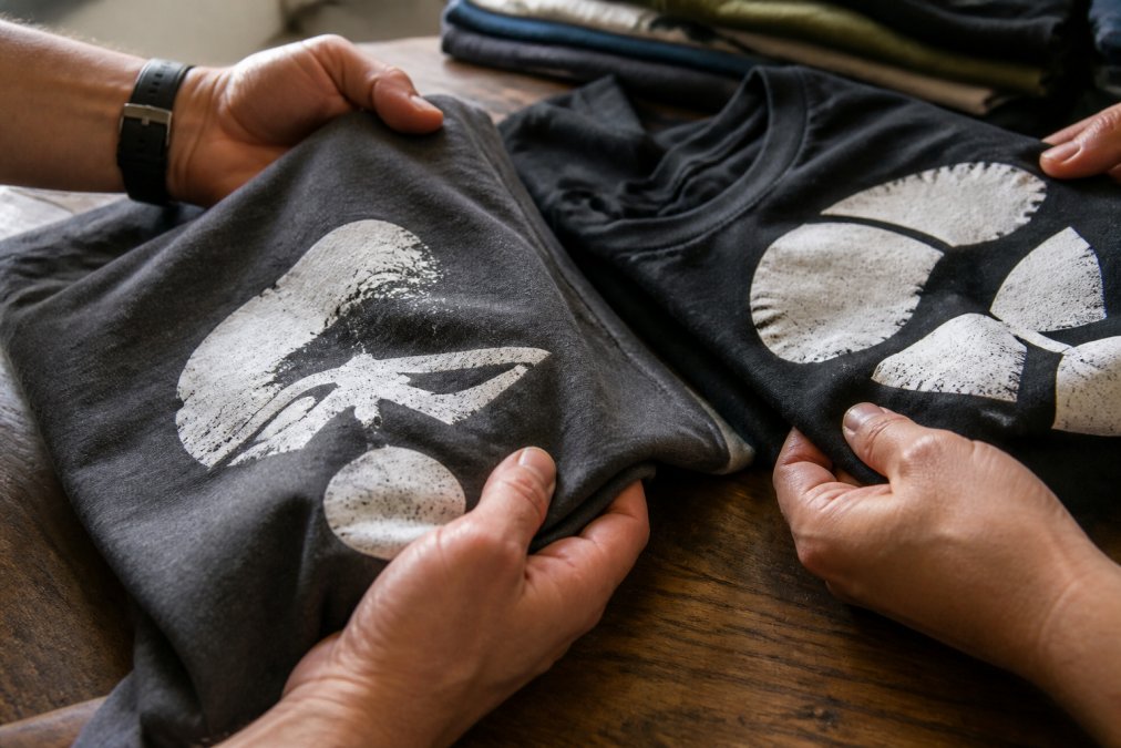
Press your fingers firmly against the design and release. Does the print crack or show visible stress lines? A quality print should flex with the fabric without cracking.
Signs of Poor Screen Printing to Avoid
Poor screen printing shows up in predictable ways. Fading or dull colors indicate old ink, improper curing, or low-quality pigments. Cracking or peeling prints are the most obvious sign of poor quality, the print was either not cured properly or applied with excessive thickness.
Inconsistent color across the design indicates uneven squeegee pressure or improper ink mixing. Visible registration errors, where colors don't align properly or you see color halos around design elements, indicate poor equipment or insufficient care during setup.
Excessive ink coverage that makes the print feel stiff and plasticky indicates either the wrong ink type or improper application. Poor edge definition, where design edges appear soft or fuzzy, indicates improper curing or incorrect ink viscosity.
How to Wash Screen Printed Shirts for Longevity
Turn the shirt inside out before washing to protect the print from direct friction and detergent exposure. Wash in cold water on a gentle cycle and avoid aggressive agitation.
Use mild detergent and avoid bleach or fabric softeners, which can damage the ink. Air dry whenever possible, high heat from the dryer can damage the print and cause cracking. If you must use a dryer, use the lowest heat setting.
Avoid dry cleaning, which uses harsh chemicals that can damage both ink and fabric. For stickers like The Wits End's durable vinyl stickers, apply them to clean, dry surfaces and avoid extreme heat or harsh chemicals.

Wash screen printed items less frequently than regular clothing. If the shirt doesn't smell and isn't visibly dirty, skip the wash and let it air out instead.
Testing Print Durability Before You Buy
Before committing to a purchase, ask the vendor about their durability testing and warranty. Ask how many wash cycles the print has been tested for, quality vendors will specify 50, 75, or 100+ washes.
Ask about their curing process. Proper curing is essential for durability. If the vendor doesn't have a documented curing process, their prints are likely not durable. Ask about ink coverage and mesh count, and whether they test for color fastness, the ability of ink to resist fading.
Request a sample or look for customer reviews that specifically mention durability. Real customer feedback is the best predictor of actual performance. At The Wits End, our hand-screened apparel like the Warning: May Spontaneously Start Talking About Retro OS T-Shirt is tested for durability and designed to last. We use quality inks, proper curing, and careful registration to ensure every print meets our standards.
![Warning: May Spontaneously Start Talking About [Platform] T-Shirt](https://cdn.shopify.com/s/files/1/0602/8866/3769/files/unisex-staple-t-shirt-dark-grey-heather-front-69fe575c8074b.jpg?v=1778665717)
| Quality Indicator | What It Means | What to Look For |
|---|---|---|
| Sharp lines and crisp halftones | Proper mesh count and squeegee pressure | No fuzzy edges or blurry dots |
| Vibrant, consistent color | Quality ink and proper curing | No dull sections or color variation |
| Clean registration | Precise color alignment | No color halos or bleeding between colors |
| Soft, integrated hand feel | Proper ink thickness | Smooth texture, not stiff or plasticky |
| No cracking or peeling | Proper curing and ink adhesion | Flex without stress lines or damage |
| Crisp edge definition | Correct ink viscosity | No bleeding or softness at design edges |
When you're evaluating screen printed apparel or stickers, you're assessing whether the vendor invested in proper technique and materials. Vendors who cut corners on mesh count, curing, or ink quality produce prints that fade, crack, and peel. Vendors who invest in the right equipment and process produce prints that last. The Wits End has built our reputation on hand-screened quality because we know that durability and design clarity matter to customers who care about what they wear. Get started with our veteran-owned shop and discover the difference that proper screen printing technique makes.
Frequently Asked Questions
Q: How can you tell if a screen print will crack or peel?
A: Poor curing is the primary culprit. Properly cured prints bond permanently to fabric fibers, while undercured prints sit on the surface. Bend the garment gently, if the ink cracks or feels stiff and rubbery, curing was inadequate. Check opacity consistency too; thin spots indicate uneven ink deposit, which leads to premature failure. Hand-screened prints from quality shops use proper mesh counts and squeegee pressure to ensure even coverage and full curing, preventing the cracking you've experienced with cheaper alternatives.
Q: What's the difference between plastisol and water-based ink for screen printing?
A: Plastisol ink sits atop fabric and delivers vibrant colors with heavy hand feel; water-based ink absorbs into fibers for a softer touch. Plastisol is more durable for frequent washing and offers superior opacity in one pass, making it ideal for bold designs. Water-based ink is eco-friendly and breathable but requires thinner mesh counts and multiple passes to match plastisol's opacity. Both can produce quality prints when properly cured. Your choice depends on whether you prioritize durability and vibrancy or comfort and sustainability.
Q: How should you wash screen printed shirts to keep them looking new?
A: Turn the shirt inside out before washing to protect the print surface. Use cold water and mild detergent; hot water weakens ink bonds and fades colors. Wash in gentle or delicate cycles, avoiding bleach and fabric softeners, which degrade ink. Air-dry whenever possible; heat from dryers accelerates fading and can weaken plastisol ink bonds. Hand-screened prints with proper curing hold up when treated this way, while poorly cured prints may fail regardless of care.
Q: Why does some screen printing feel thick and rubbery?
A: Thick, rubbery feel indicates heavy ink deposit or improper curing. Quality prints use precise squeegee pressure to deposit just enough plastisol or water-based ink to achieve full opacity without excess buildup. Undercured plastisol feels stiff and plasticky; overcured ink becomes brittle. The best hand feel balances opacity with comfort, you should barely feel the ink when wearing the shirt. Hand-screened prints from experienced printers achieve this balance through proper mesh count selection and curing temperature control.
This article was written using GrandRanker