 1-361-589-1048
Table of Contents
- Why Modern Irony Graphic T-Shirt Designs Hit Different in 2026
- Aesthetic Graphic Tees: The Visual Language of Modern Irony
- Sarcastic T-Shirt Design Trends Defining 2026
- How to Style Graphic Tees with an Ironic Edge
- Standout Modern Irony Graphic T-Shirt Designs Worth Buying
- Quality, Fit, and Why Hand-Screened Irony Tees Last Longer
- Conclusion
- Frequently Asked Questions
Last Updated: September 10, 2026
Why Modern Irony Graphic T-Shirt Designs Hit Different in 2026
Modern irony graphic t shirt designs let you say something without saying it. The joke lands, the point gets made, and nobody has to explain themselves. That layered quality, the shirt means what it says and the opposite at the same time, is why this category keeps outselling straightforward slogan tees.
The Wits End is a veteran-owned shop that hand-screens apparel for makers, thinkers, and vintage enthusiasts, and the designs that move fastest are the ones that reward a second read. According to Pew Research Center's findings on internet humor and meme culture, younger adults increasingly use irony as their default mode of online and offline expression. That habit has moved directly onto cotton.
Most style guides get this wrong: ironic tees aren't a novelty. They're a wardrobe staple for anyone whose personality doesn't fit on a standard inspirational quote.
Below, we break down the aesthetics, the trends, and the styling moves that make these shirts work in 2026.
Aesthetic Graphic Tees: The Visual Language of Modern Irony
Aesthetic graphic tees are shirts where the design carries the joke, not just the words: a deadpan slogan in a corporate font, a retro interface element repurposed as decoration. The visual reference does half the work before anyone reads a syllable.
Two visual families dominate right now.
Retro Tech and 1980s Computer Nostalgia
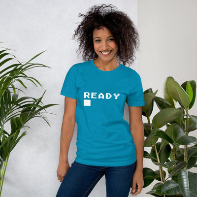
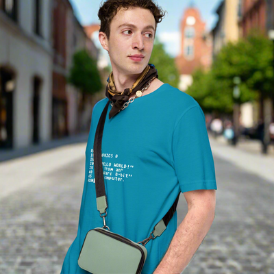
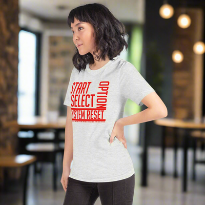
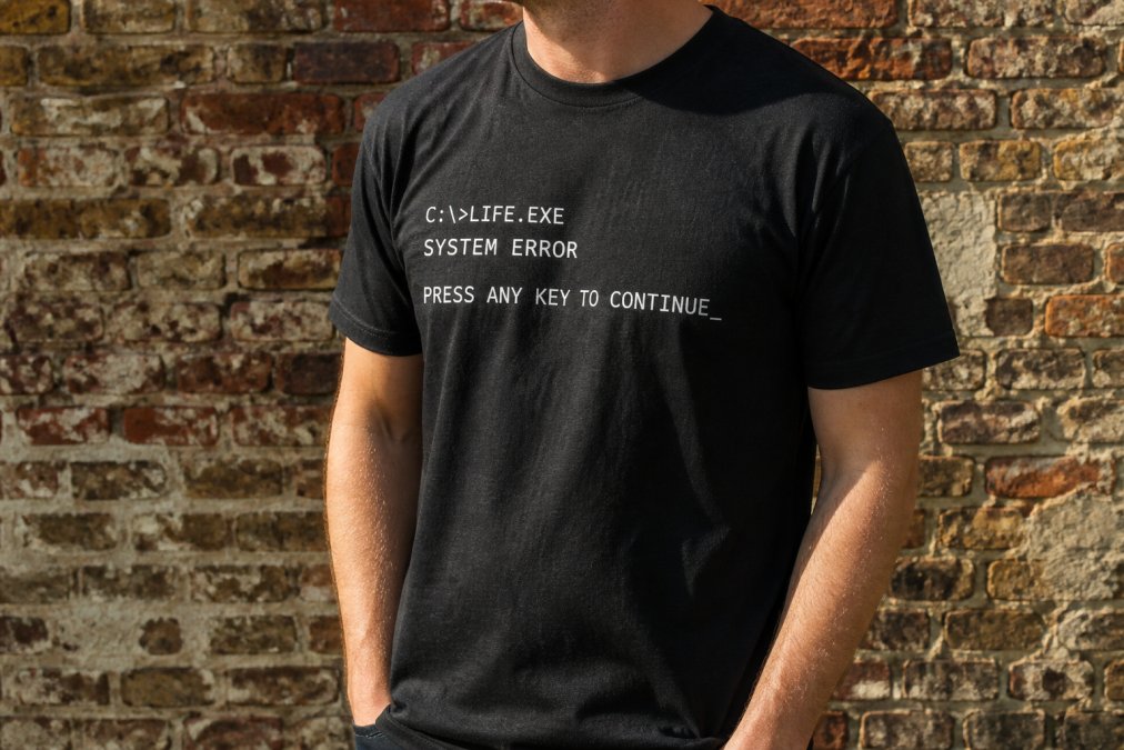
Nothing signals modern irony like a design that treats a 1980s operating system as high art: command-line prompts, boxy pixel fonts, the beige-and-grey palette of early computing. The humor comes from the mismatch, clunky hardware presented with genuine affection.
This is where geek culture and fashion overlap most cleanly. A shirt like the Warning: May Spontaneously Start Talking About Retro OS T-Shirt ($16.59) turns "warning label" into a personality disclosure. It reads as a joke until you realize it's also true.
Typography-First Designs and Visual Humor
Typography-first designs let the lettering be the entire graphic: no illustration, no mascot, just a phrase set in a font that undercuts the message. Comic Sans used ironically, Helvetica used with unsettling sincerity. The gap between typeface and text is the punchline.
Sarcastic T-Shirt Design Trends Defining 2026
Sarcastic t-shirt design trends in 2026 lean into self-deprecation and dry observation rather than punch-down humor. The best sellers admit something true about the wearer.
Meme culture trained a generation to compress a full comedic bit into one line, and sarcastic slogans borrow that compression. I Can't Brain Today, I Have the Dumb ($16.50) is a meme you can wear: relatable, endearingly pathetic, and it never has to explain itself.
The same instinct shows up in grammar humor. The misuse of "literally" makes me figuratively insane ($16.50) is a niche complaint dressed as a joke, which is exactly the formula that works.

| Trend | What It Looks Like | Who It's For |
|---|---|---|
| Self-deprecating slogans | "I Can't Brain Today" style one-liners | Anyone with an off day |
| Grammar and language humor | Punctuation jokes, wordplay | Writers, editors, teachers |
| Retro tech references | Old OS warnings, pixel fonts | Programmers, vintage computing fans |
| Deadpan social humor | Introvert and small-circle jokes | People who leave parties early |
How to Style Graphic Tees with an Ironic Edge
Most guides stop at "pair it with jeans", that's a default, not styling. Ironic tees are harder to style than plain ones because the graphic does the talking, and everything around it has to support the bit without stepping on it.
Start with the silhouette, not the shirt
The biggest variable is the drop between your shoulder seam and the shirt hem. Hitting at the hip bone reads casual and intentional; at the waistband, cropped and deliberate; at mid-thigh, like you borrowed it, which works only if the rest of the outfit is sharp.
Stylists follow a "one oversized, one fitted" rule. If the tee is boxy, keep the bottom slim: straight-leg denim, a pencil skirt, tapered chinos. If the tee is fitted, go wide below: baggy carpenter jeans, wide-leg trousers, a midi skirt. Two oversized pieces read as accidental.
Four outfit formulas that work
- The half-tuck with straight-leg denim. Front-tuck the tee into high-waisted straight-leg jeans, leave the back loose, add a belt matching your shoes. The tuck creates a waistline the boxy tee would otherwise hide.
- The open overshirt. Wear the tee under an unbuttoned flannel, chambray, or work jacket. The overshirt frames the graphic like a mat frames a print; roll the sleeves once so the tee sleeve peeks out.
- The monochrome base. Match your pants and shoes to one of the colors in the graphic, then let the shirt's other colors pop. This is how you wear a loud tee without looking loud.
- The layered long-sleeve. A plain long-sleeve tee under a short-sleeve graphic tee is a 1990s move that reads as intentional again. Keep the under-layer a solid neutral: white, black, heather grey.
What to avoid
The most common mistake is stacking two loud pieces: an ironic tee plus patterned pants plus a graphic hat turns a clever outfit into visual noise. Pick one statement per outfit. Second: don't over-accessorize the neckline. If the graphic sits high, skip the necklace; if it sits low, a single short chain can work.
Fit notes by body type
Unisex tees are cut straight through the waist, which flatters some frames and swallows others. Narrower frames: size down one for a fitted look without going cropped. Broader frames: your usual size reads relaxed, and sizing up gives an oversized look without pulling at the shoulders. The shoulder seam should land at or just past your shoulder bone; if it creeps down your upper arm, the shirt is too big.
Standout Modern Irony Graphic T-Shirt Designs Worth Buying
The best modern irony graphic t shirt designs work on two levels: the wearer gets the joke, the observer gets a second one. Here are the ones worth your money.
For the socially selective, "Luckily, I Don't Have Enough Friends for an Intervention" ($16.59) is an introvert joke, a self-aware joke, and a small-circle flex at once. Sizing runs XS through 5XL across a wide color range.
If your humor runs a little bluer, Life Is So Much Funnier When You Have a Dirty Mind ($16.50) delivers the same energy in a cheekier package. The matching ceramic mug ($11.50) and 32 oz water bottle ($24.00) turn it into a gift set.


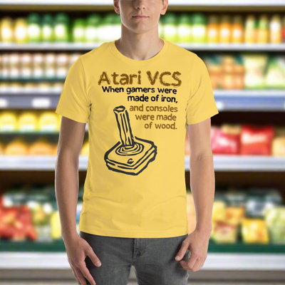
For the retro-computing crowd, the Warning: May Spontaneously Start Talking About Retro OS T-Shirt ($16.59) comes in dedicated versions for Amiga, Atari, BSD, Linux, and more. It's the kind of design that only makes sense to the right person, which is the whole point.
Quality, Fit, and Why Hand-Screened Irony Tees Last Longer
Print quality is where cheap graphic tees fall apart and where buyers get misled. The label says "screen printed," but different processes hide behind that phrase, and they age very differently.
The four print methods, ranked by longevity
Plastisol screen printing is the industry standard for durable graphics. The PVC-based ink cures under heat and locks into the cotton fibers. Done well, it outlasts the shirt; done poorly, it cracks along fold lines within a dozen washes.
Water-based screen printing uses pigment suspended in water rather than plastic. The ink dyes the fiber instead of sitting on top of it, so the print feels like part of the shirt and never develops that plastic hand (screenprinting.org). It fades faster than plastisol, but it fades evenly, which many wearers prefer.
Direct-to-garment (DTG) printing is what most print-on-demand shops use: a modified inkjet printer lays water-based ink directly onto the fabric. Cheap and setup-free, it dominates the dropship market, and has the shortest lifespan of the four methods, especially on dark shirts, where the white underbase cracks first.
Heat transfer and vinyl are the cheapest options: a design is printed onto a carrier sheet and pressed onto the shirt. It sits on the fabric like a sticker, feels stiff, and peels from the edges inward, what you're usually getting from a $12 marketplace tee.
What actually determines how long a print lasts
Three variables matter more than the method name:
- Ink deposit weight. A thin, even deposit flexes with the fabric. A thick deposit cracks. Hand-screening lets the printer control this in a way automated DTG cannot.
- Cure temperature and time. Under-cured ink washes out. Over-cured ink becomes brittle. This is the step most cheap operations rush.
- Fabric weight and knit. A 4.2 oz/yd² combed ring-spun cotton tee has a tighter, smoother knit than a 5.3 oz open-end cotton tee, which means the ink sits on a more uniform surface and the print looks cleaner from day one (cottoninc.com). Heavier isn't automatically better; the knit matters more than the number.
The sustainability angle most guides skip
Made-to-order production means the shirt is printed after the order is placed, cutting deadstock to near zero.
On the ink side, water-based and plastisol-free options are available. If a shop can tell you what's in its ink, that's a good sign. If it can't, that's information too.
Fit and sizing specifics
Unisex sizing runs XS to 5XL, with exact length and width measurements on the size charts. Two numbers matter most: chest width (one inch below the armhole) and body length (high point of the shoulder to the hem). Compare those to a tee you already own and like, not to your body, the fastest way to get the right size on the first order.
Pre-shrunk, side-seamed, and taped shoulder-to-shoulder construction is what keeps the shirt from twisting in the dryer. A side-seamed tee has a seam running down each side; a tubular tee is a continuous tube of fabric that will torque after washing. If the product page doesn't say side-seamed, assume it isn't.
Conclusion
The hard part of wearing modern irony graphic t shirt designs isn't finding a shirt, it's finding one that sounds like you and survives. Most options are either a generic joke or a print that gives up by spring.
That's the gap The Wits End was built to fill. As a veteran-owned shop, we hand-screen designs for geek culture, retro technology, and progressive values, with inclusive sizing up to 5XL and prints built to last. Every order is made on demand, so nothing sits in a warehouse waiting for you.
Get started with The Wits End and find a shirt that says the thing you'd never say out loud.
Frequently Asked Questions
What defines a modern ironic graphic t-shirt design?
Modern irony graphic t-shirt designs rely on layered meaning. The joke works on two levels: what the shirt literally says and what the wearer actually means. Think grammar-police humor like 'The misuse of literally makes me figuratively insane' or retro-tech disclaimers like 'Warning: May Spontaneously Start Talking About Linux.' The design often uses clean typography, vintage-inspired layouts, or deadpan phrasing to land the joke. It is less about being loud and more about being in on something.
How do I style ironic graphic tees for a contemporary look?
Start with fit. A boxy or relaxed cut reads more current than a tight tee. Tuck the front into high-waisted jeans or layer it under an open button-down or denim jacket. Keep the rest of the outfit simple so the graphic does the talking. For a streetwear aesthetic, pair with wide-leg trousers and chunky sneakers. For casual wear, cuff the sleeves once and add a baseball cap. The goal is to let the humor feel intentional, not accidental.
Are ironic t-shirts still popular in 2026?
Yes, and the trend has matured. Instead of loud meme-inspired apparel, buyers now gravitate toward subtle, personality-driven clothing with dry humor and niche references. Sarcastic slogans about grammar, retro computing, and social quirks are selling well because they signal in-group identity without shouting.
How has the aesthetic of ironic graphic tees evolved?
Early ironic tees leaned on shock value and obvious punchlines. Today the aesthetic borrows from vintage iron-on looks, retro style typography, and minimalist digital art. Designs feel more curated, often referencing pop culture, geek culture, or 1980s computer nostalgia. The humor is drier, the visuals are cleaner, and the fit is more deliberate. Brands now treat irony tees as wardrobe staples rather than novelty items.